


Mission Allies
Project Summary
Mission Allies is a consulting agency that helps nonprofits achieve and increase their fundraising goals.
ROLE: UX RESEarch, Information Architecture, Visual Design, BRANDING
Client: Mission Allies
Mission Allies approached with a need to reposition their brand with a major focus on a website redesign.

Goals & Process
Research
Design research methods were used to help define the project branding goals and identify usability issues within the existing site.
DESIGN DISCOVERY
As part of the Design Discovery phase we used the following research methods to establish the goals of the website redesign and rebrand:
Stakeholder Interviews
Content Audit
Comparative Analysis
User Survey
Research Insights
As a result of the stakeholder interviews the main challenges we wanted to address were positioning the brand within their current audience as a trusted local leader in their field.
Mission Allies also wanted to stand out from existing consulting companies and ensure that the personality of the team came across in the brand image.
During our site audit and survey we discovered the existing website lacked the information that clients were searching for.
Goals
The main goals of the site restructure and redesign were to:
Quickly answer potential client questions about Mission Allies
Increase leads and client conversion
Position Mission Allies as an established results driven company
Information Architecture
Using the results of the stakeholder interviews, user needs, and comparative analysis the site structure was refined.
Content Structure
Early version of the information architecture and site structure.

Preliminary information architecture and content structure map.
Wireframes
Sketched lo-fi wireframes were useful to quickly layout ideas and set the structure for content.

Quick low fidelity wireframes based on the new information architecture.
RAPID ITERATIONS
After the sketching stage the lo-fi wires were refined and iterated on in Adobe XD.
Design Solutions
Meeting Key Goals
Each page was designed with both the target user and stakeholder business goals in mind.
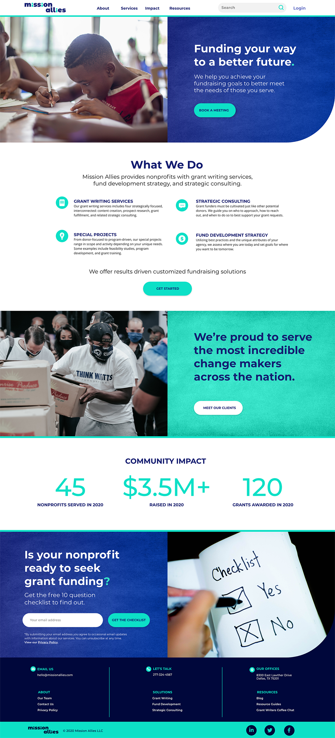
HOME PAGE DESIGN INSIGHTS
An immediate call to action on the home page prompts the audience to engage by booking a meeting.
Users are provided a brief summary of services while a showcase of community impact establishes trust between the potential client and Mission Allies.
Clear calls to action within each content component section prompt the user to take the next step in engaging with Mission Allies.
The Mission Allies Story
A secondary goal of the redesign was differentiating Mission Allies from their competitors who portray a more conventional business image.

ABOUT PAGE DESIGN INSIGHTS
By using a subtle texture along with illustrated images of the team we were able to convey the friendly and cheerful nature of the company.
To match the brand voice a friendly conversational tone is used consistently throughout the content.
Client Stories as Case Studies
Telling the Mission Allies story through client impact serves a dual purpose.

Case Study LANDING design insights
Within the Client Stories landing page the card component was designed to showcase results without having to dig deeper.
The showcase of results driven data along with a wide range of clients establishes Mission Allies as a trustworthy organization with roots in its community.
Showcasing Customized Solutions
Each case study page highlights key data points along with a brief overview of the customized solutions that Mission Allies provides to each client.

case STUDY PAGE design insights
Large bold images and a client testimonial balance the quantitative data.
Including a call to action at the bottom of each page establishes a pattern for the user and allows them to easily engage by beginning a conversation, asking a question, or booking a meeting.
Visual Design System
Branding Mission Allies
In order to differentiate from competitors it was important to convey the approachable, and energetic characteristics of the brand.
Logo DESIGN
The final logo concept is professional yet approachable and influenced by community ties and teamwork. The i’s represent the community and the team. The N and L create the bridge or connection between the client organizations, Mission Allies and the community.
SCALABLE LOGO SOLUTION
Along with a new logo a simplified symbol was designed to be used as a favicon, in social media profiles or other instances that require a smaller asset size.
Color Palette
The business blue grounds the brand and the accent color, an electric teal, conveys the results driven and energetic qualities of the Mission Allies team.
Typography
A typographic system was created to easily establish content hierarchy.
Cross Functionality
The paired typefaces strike a professional yet friendly balance. Thought was taken to ensure cross functionality of the typography.
The type system was carried through all Mission Allies brand assets including digital presentation decks and printed materials.
UI Design
To maintain the new brand standards the user interface components needed to convey a friendly and approachable feeling.
USER INTERFACE COMPONENTS
Rounded corners were used to add a touch of friendliness and visually tie the UI elements to the new logo design.
An excerpt from the UI design system created for Mission Allies.
Results
The new Mission Allies website and visual identity positions the company as an expert choice for professional non-profit consulting services.
Visual Identity
The new identity conveys the brand ideals of providing a friendly team of expert support with a custom tailored approach for each client.
Website Design
The redesigned site allows target users to quickly find the information they need in order to make quick decisions. Friendly and visually bold calls to action on each page make it easy to get in contact and take the next step.
INCREASING CLIENT LEADS
A/B testing Calls to Action (CTAs)
By using a component based design system and analytics such as click through and sign up rate the team is able to continually refine the tone and voice of the UI text in order to increase leads.