

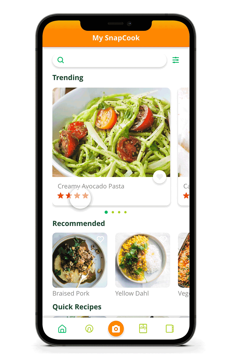
CookSnappy App


Users identify ingredients and search for recipes by using the camera feature.
Project Summary
CookSnappy allows users to quickly find and cook recipes with ingredients they have on hand.
Role
User experience (UX) research, interaction, visual, and user interface (UI) design, Prototyping
Client: Cidno
Working within a team setting I lead the user experience for the snap/scan and visual search by ingredients features of the app.
I also helped lead the visual design team of two other designers, conceptualizing the app icon, refreshing the look and feel and creating the UI style guide.
Goals & Process
The project brief was used to outline the initial key goals and identify MVP success parameters for the stakeholders and end users.
Goals
To create an easy to use app that allows home cooks to use existing ingredients to find recipes.
Recipe generation based on currently owned foods to eliminate food waste minimize food expenses.
Scanning feature to identify produce, the freshness of produce, etc.
Step by Step details for found recipes.
Challenges
A major challenge was frequently changing stakeholder goals along with a need to rapidly test solutions.
A pivot to target a different user demographic led to a visual redesign alongside the development of the app.
Shifting back end technology parameters for the recipe search and augmented reality identification increased the need to quickly adapt flows and maintain collaborative communication with the engineering team.
Design Discovery & UX Research
UX research methods were used to refine the project goals and the success parameters of the experience for the users.
Collaborating with the research team and stakeholders the following were used to begin developing the task flows for the project:
Project Brief / Product Vision
The project brief was used to outline the initial assumptions for CookSnappy and define the success parameters of the experience for the users.
Comparative Analysis
A comparative analysis report was provided by the stakeholders. As a design lead I initiated further competitor research to better understand the unique value we could bring to the existing cooking and recipe app market.
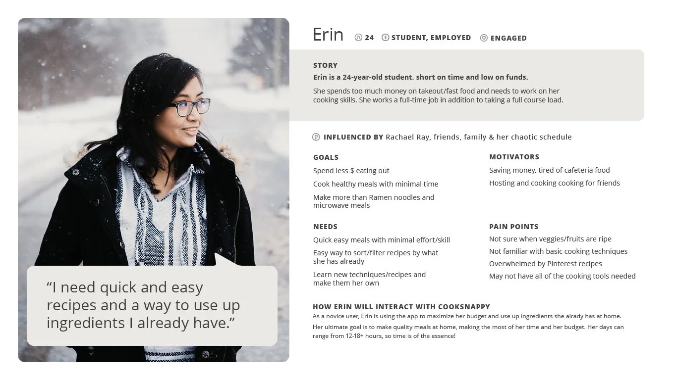
Personas
Personas were key to keeping the user in mind while developing the journey and task flows for the scenarios.
Design Sprints
As a team we met for design sprints to work through the more complex task scenarios and flows. This allowed us to iterate on a large amount of ideas ideas quickly and efficiently.
Meet the User
Because of the fluctuating goals of the app, keeping a collaborative and fluid workflow with the research team was key to meeting both user needs stakeholder goals.
Personas and Collaboration

One of the original user personas provided by the UX Researcher.
Changing Demographics
With ongoing testing and research the user morphed from a experienced home cook to a novice cook just starting to explore their culinary skills.
Using my marketing background I realized during the shift to a younger audience that to better appeal to the user the app could adopt a more informal tone.
A visual and tone refresh was initiated. It included a revised color scheme and updated UI copy writing to create more casual, upbeat and friendly tone.
An adapted user persona denoting a younger more novice cook provided by the UX researcher.
Design Solutions
Task Scenarios and Flows
After our initial design sprint sessions the tasks were broken up and iterated on individually.
Task flow for recipe search from an existing item using the camera ID function.
Wireframes
Wireflow designed to show the interaction path of the camera item detect function and recipe search.
Rapid Prototyping
Recipe Search by Ingredient
By mocking up the camera AR function within an XD prototype we were able to quickly test and find pain points.
Augmented reality item identification
Early version of the camera ingredient identification functionality.
The function was tested and user pain points identified and iterated on rapidly.
My Pantry Recipe Search
Leveraging Adobe XD’s prototyping functionality we were able test and adapt solutions quickly based on user feedback.

Drag and drop recipe search
Prototype of drag and drop search function that allows cooks to search for a recipe based on ingredients in their pantry.
Using ongoing user testing we were able to quickly adapt the functionality of the search.
Usability Testing
Testing and observing users directly helped us to quickly discover if our design solutions were viable and headed on the right path.
Testing Goals
Test app concept with target audience
Test task completion rate with target audience
Reveal usability pain points
Testing Methodology
User Screener Questionnaire
Task Scenario Pre-Test
Task Scenario Test
Post Test Questions
System Usability Scale (SUS) Survey
Accessibility Contrast Checker
User Overview
A screener questionnaire was used to ensure alignment with the target audience. We wanted to make sure that tested users cooked at least occasionally and had an interest in reducing food waste.
Ages: 23–40
Gender: Male 45% Female 55%
Cooking Experience: All users reported cooking at least 2-3 times a week.
Identifying User Pain Points
Patterns of usability issues emerged during the task scenario / prototype testing.
Task Scenario Insights
I participated in the testing sessions with the research team for the camera and search by ingredient task scenario sessions.
Being able to directly observe the users as they attempted to complete the tasks allowed us (the design team) to put aside any bias that we had towards our design solutions and experience first hand patterns of usability pain points.
As the lead visual designer it was insightful to find out that some of our icons were not understood. And although we as a team assumed that the camera icon would be intuitively understood many of the tested users had difficulty initiating the task of using it to start a recipe search.
Improving the User Experience
Using the qualitative test results we were able to quickly iterate potential solutions based on the user observations.
Ingredient ID and Recipe Search
Pain Points
Trouble beginning task
Unaware of use of camera icon to begin ingredient identification
Not sure what some of the tab navigation icons are for
Trouble beginning task or unaware of item scanning and recipe finding features
Solutions
Major insights to improve the user experience were:
Highlight or make more prominent the camera icon in the tab navigation
Add tab icon descriptor text to tab navigation icons ie Home, My Pantry, Favorites, Scan Item
Redesign icons
Onboarding tutorial flow option when user has successfully logged into the app
Recipe Search by Ingredient
Pain Points
No recipes shown due to too many ingredients being added.
Solutions
Major insights to improve the user experience were:
Limiting the number of ingredients added to the search to increase probability of matching recipe.
Limiting recipe results as to not overwhelm the user with too many choices.
Adding a filter functionality
Accessibility
Pain Points
Text is hard to read in sections of the app
Drag and drop could be a WCAG issue
Solutions
Use contrast checker, to identify appropriate color contrast and revise
Provide an alternative interaction method for drag and drop
Visual & UI Design
App Icon, Color, and Typography
To better appeal to the new target user the app was given a bolder color scheme and casual tone.

An excerpt from the CookSnappy brand style guide.
App Icon Design
The app icon plays with the combination of a cooking pan and magnifying glass to emphasize the search by ingredient function of the app. Multiple app icons designs were presented.
Color Palette
Bold, fresh, and vibrant colors were used to appeal to the target user.
Typography
A friendly typeface with rounded edges was used for the app logo. To minimize load times the standard iOS typefaces were used within the app structure.
User Interface Design
The user interface components were updated to align with the new target user.

An excerpt from the UI design guide created for CookSnappy.
User Interface Components
Bold colors were balanced by using negative space and areas of white to maintain the bold, fresh feel of the UI without visually overwhelming the user.
Tab Iconography
Care was taken to ensure that all of the iconography in the app related and was true to the casual friendly tone of the app. The use of rounded corners was kept consistent through the app icons and UI elements.
Key Results
By using design sprints, rapid prototyping, and user testing we were able to quickly turnaround solutions and meet the high end goals of the app.
Takeaways
Collaboration
Collaboration and communication among the teams was key to meeting changing goals. We made efficient use of Slack channels and Trello to help keep everyone in tune.
Rapid Prototyping
As a design lead on this project I found the challenge of moving quickly from idea to producing actionable solutions via rapid prototyping extremely rewarding.
Being able to introduce micro interactions such as the camera identifying an ingredient at an early stage also helped our users feel like they were using a real product and revealed issues early.
Learning Opportunities
The challenges on this project were learning opportunities and although the stakeholders decided to pivot and morph the app into a different product we were able to meet all of the goals to create a minimum viable version of the app.
Based on the post user SUS survey we discovered that 93% of our target users responded that they would likely download the app.